Hey everyone, I’ve been diving into customizing my Home Assistant setup, and I’m really excited about the possibilities! One thing I’ve been working on is creating a floor plan dashboard that integrates buttons for controlling lights and covers. While the default icons work for lights—gray for off and yellow for on—I’m not so happy with the covers. They show as gray when closed and purple when open, which doesn’t quite match my aesthetic.
I’ve been trying to customize the icons and colors for both the open and closed states of the covers. Here’s the code I’ve been experimenting with:
yaml
views:
- title: Test
path: test
cards:- type: picture-elements
elements:- type: state-icon
entity: cover.kueche_rollo
style:
left: 15%
top: 15%
border-radius: 50%
text-align: center
background-color: rgba(255, 255, 255, 0.3)
state:- value: ‘closed’
icon: mdi:lightbulb-on - value: ‘open’
icon: mdi:door-closed
tap_action:
action: toggle
- value: ‘closed’
- type: state-icon
entity: light.wc_licht
style:
left: 10%
top: 10%
border-radius: 50%
text-align: center
background-color: rgba(255, 255, 255, 0.3)
tap_action:
action: toggle
state:- value: ‘off’
icon: mdi:table-chair - value: ‘on’
icon: mdi:door-closed
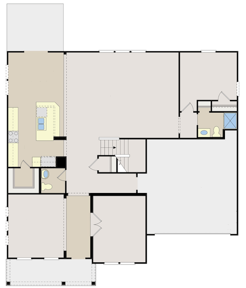
image: https://demo.home-assistant.io/stub_config/floorplan.png
type: panel
- value: ‘off’
- type: state-icon
- type: picture-elements
Despite this, the default behavior persists. I’m not sure what I’m missing in the state configuration, and I’m also unsure how to set the icon color. Has anyone successfully customized state icons and colors for covers? Any guidance or tips would be greatly appreciated! 